
When you plan a wedding, finalizing the best invitation card is a significant aspect of the planning and takes considerable time. You want the design of your wedding card to be unique and beautiful as an official wedding invitation is traditionally incomplete without it. But, when it comes to finalizing, it is quite possible that you might get confused about which design to choose as there are plenty of options available. It gets tougher when you do not have any preferences or a vague idea of what kind of design you want the card to have. So, here are few tips to help you choose the best wedding invitation card:
Wedding Theme
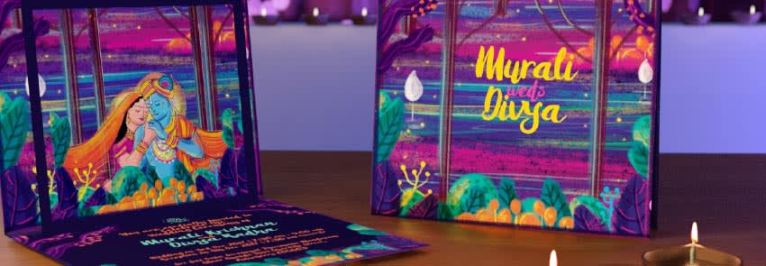
The design of your wedding card should suit the wedding theme. If you want to keep it modern and classy, go for a design that is modern. Similarly, if you want to keep it traditional, opt for a traditional design. People who want to keep it easy-going should go for something that has a casual tone. Most wedding cards in India are traditional as they have religious symbols or quotes. However, many people have shifted their focus to modern designs over the last few years.
Colours
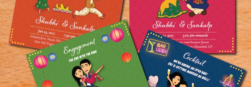
A typical wedding card in India features bright glittering colours like golden or cream or silver as they symbolize celebration. However, modern designs include various shades of soothing pastel colours, metallic fonts, and liners. So, if you want to beautify your invitation card, give it a contemporary touch by introducing modern embellishments. Just ensure that the colours you choose do not ruin readability.
Fonts
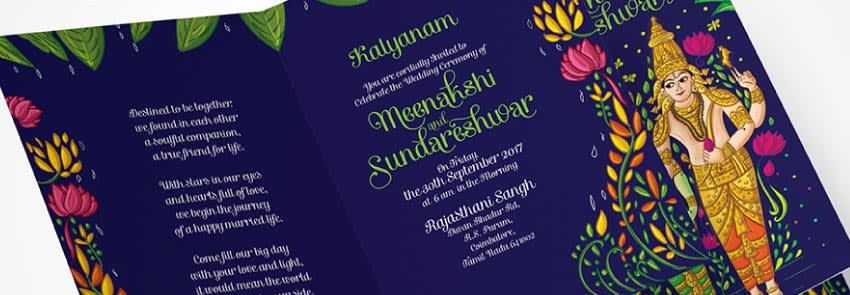
The fonts that you use to present the information you include in your wedding card should be chosen carefully, too. Avoid light ink on a light-coloured background and similarly, avoid any colour that makes the information difficult to read. Make sure that you choose readable fonts because the most important point of a wedding card is to give them event details.
Content
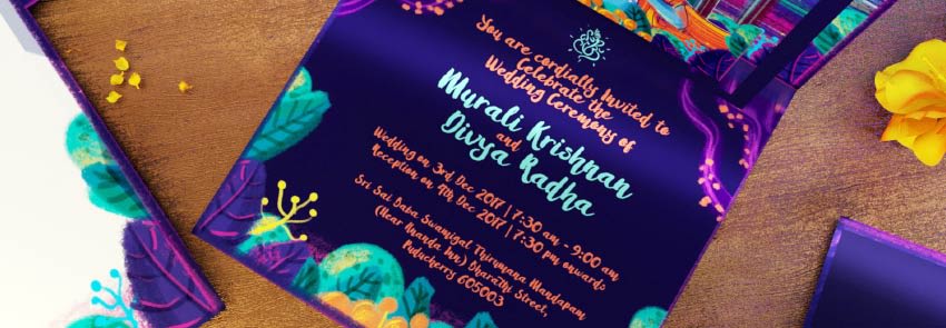
The content tone of your wedding card should not be informal or casual. No matter how casual or modern the design is, the content should have a pleasant sense of floweriness. There are some rules that you need to follow, for e.g. the host is included first, spell every bit of your content, and add a customary invitation line like ‘we request you to grace the occasion with your presence’.
Shape and Size
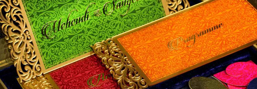
Usually, 4.5 inch by 6.25 inch is chosen as the size of a typical wedding card. However, some people like to give a modern or unique touch to the look of their wedding card by opting for circular or square or elliptical cards. Just make sure that the size does not exceed the traditional size to a huge degree.
Apart from these aspects, it is also important to proofread the content before you get your design printed, so you do not leave even one bit of the required basic information like the venue’s complete address, contact number, event dates, and other relevant event details. It should not only be beautiful, but it should also be informative enough to serve its basic purpose.
